The PROCESS
1. Understanding & Defining the Problem
Because this project was heavily focused on idea generation and prototyping techniques time spent defining the user, their needs, and problems was abbreviated. I investigated topics like how smart tech is used in the home, the availability of utility data, and pain points encountered around utility costs. I found that energy and utility consumption was an issue that virtually every home and apartment dweller deals with and many struggle to track, budget, and pay for these bills.
More specifically, research showed that
- Many users struggle to accurately budget for utilities
- Lack of detailed data makes it difficult for users to reduce costs in specific and intentional ways
- Manual tracking is generally required to get an estimate of how bills change month-to-month and season-to-season
- Nearly a third of households in the United States have reported trouble paying their energy bills according to the Energy Information Administration
These findings show that there is potential to improve user's awareness, experiences, and behaviors around utility usage.
Problem Statement: Users need an accessible and accurate way to access their utility data in order to properly budget, reduce costs, and improve communication about their consumption.
3. Product Requirements
After creating and refining several sketched concepts, reviewing user research, and considering possible use cases of the device I landed on three requirements to guide decisions when creating the prototypes.
- Users should be able to view their utility usage data in a simple and accurate manner
- The application should help users to better understand the costs associated with various utility categories and appliances
- The application should allow for the comparison of usage data between household members in order to facilitate communication around utilities
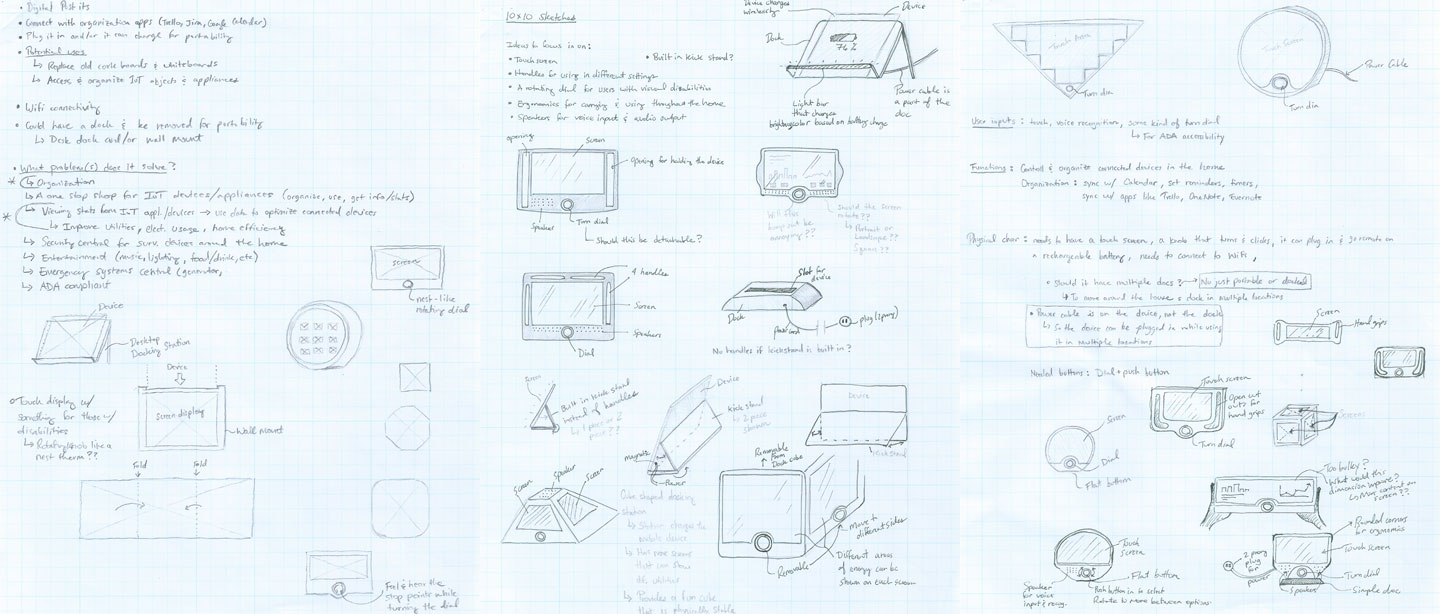
4. Physical & Paper Prototypes
Physical Prototype
To better replicate a realistic experience of the Home Base a physical prototype was created. I chose to test a design that was portable, lightweight, able to process multiple user inputs and accommodating for individuals with visual or motor disabilities. A sleeve was created on the physical prototype so that the paper prototype could slide into the screen space. This feature was used while testing the paper prototype.
Other features of the form factor include
- A touch screen for user input
- A rotating dial and center button for additional user input with support for screen readers
- An wired power adapter that charges the devices and allows for cordless use
- A built-in stand to support upright viewing on surfaces
- A speaker that wraps around the top of the device for voice input and audio output
Paper Prototype
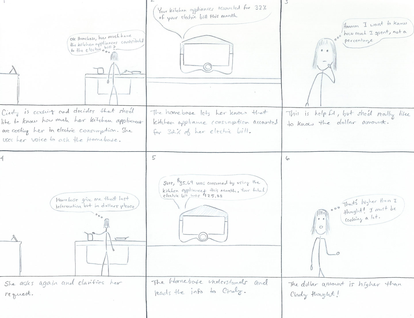
The paper prototype included low fidelity sketches outlining a few key user flows through the application. After creating a profile and logging in, a user will enter the home screen where they will be presented with options to view their usage data or compare their usage data. Both sections contain various options for drilling down into specific data visualizations and stats.
Navigation options are presented in a menu that is anchored to the bottom of the screen. Here users can quickly return home, change settings, get help and return to the previous screen.
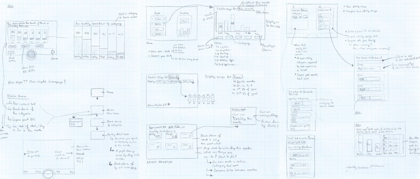
The "pre-paper prototype", which helped to establish the base layout of each screen and visualize a user's flow through the two main areas of the application. At this stage, I realized that some content could be further segmented in order to reduce the overall density of information on each screen.
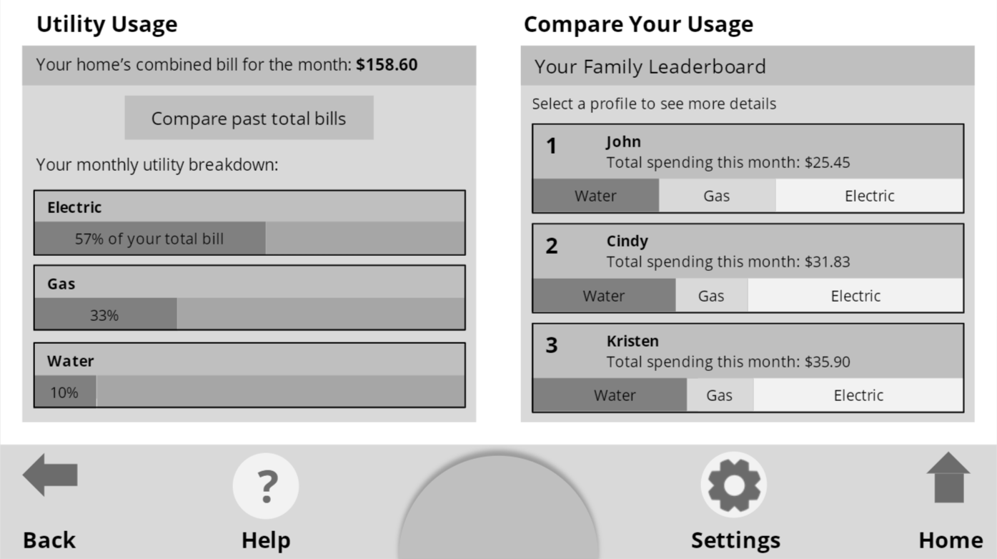
Home screen displaying the two main branches of the app
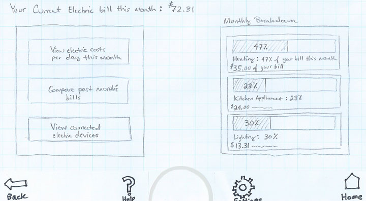
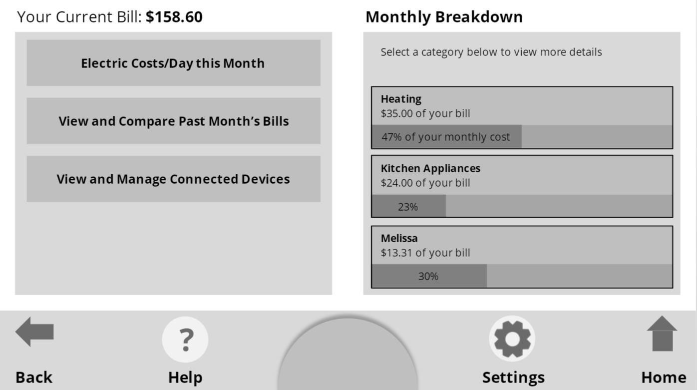
Main screen displayed when the electric category is selected from the home screen
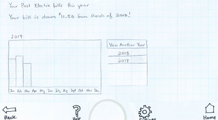
Viewing a year's electric bill across each month
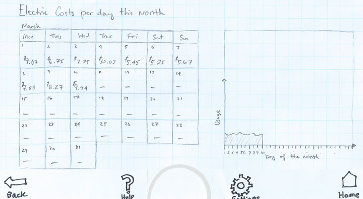
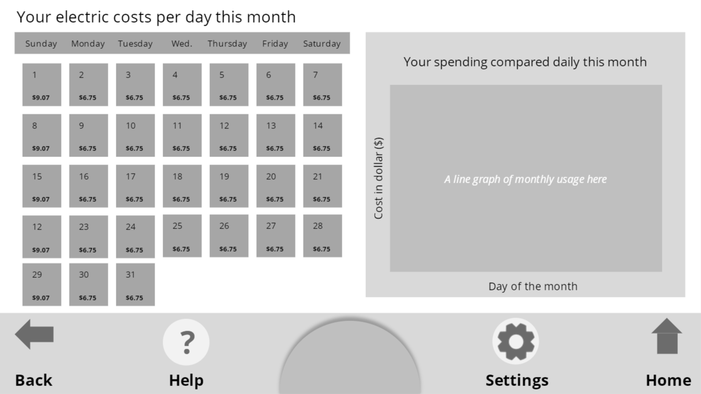
Electric costs broken down per day over the course of a month
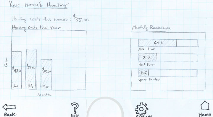
A detailed view of overall heating consumption per month over a given year and by heating type in the current month
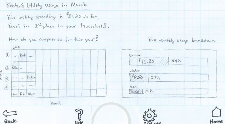
A user's profile view after entering the comparison branch of the app
5. Testing
Test Overview
The paper prototype was tested with two evaluators. Both evaluators owned and regularly used smart devices in their homes and were interested in reducing their utility bills.
Testing involved
- A task analysis consisting of three tasks
- A think aloud protocol, which was performed as the evaluators moved through the task analysis
- Follow up questions to better clarify certain moments during the task analyisis
The task analysis was evaluated on a pass/fail basis and time measures were not collected so that participants could provide their thought processes, emotions and insights for the think aloud protocol.
Results & Insights
Both participants were successful in completing all three of the tasks and comments were recorded during the think aloud protocol. Some of the key findings are listed below.
Pros
- Users appreciated the consistent navigation menu
- User input methods felt familiar to the participants because they mimicked mobile and tablet devices they owned
- The participants generally found the presentation of usage data to be useful and clear
Pain points
- The evaluators were confused when trying to identifying the goal of some sections because of a lack of descriptive labeling
- Some of the selectable elements of the application did not visually communicate their selectable/tap-able nature
- Some of the graphs could be better labeled
- In general, evaluators wanted more opportunities to customize and filter the data provided
- A lack of consistency between dashboards hurt learnability for both evaluators
6. Low Fidelity Interactive Prototype
User feedback from testing the paper prototype was used to create an interactive clickable prototype. The interactive prototype was created with a slide share software called Storyline. Storyline is similar to PowerPoint, but includes support for variables and triggers which were used to add the interactive aspects of the prototype. While more detail was added to the interface compared to the paper prototype I kept the visual style simple and focused on the layout, content, and flow of the experience.
Changes implemented based on testing
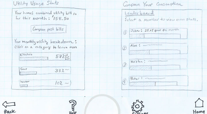
- Graphs were better labeled with percentages and dollar amounts to better inform users about the data
- Selectable sections were given additional borders and visual cues as well as instructions to inform the user of the purpose
- In the digital prototype, the leaderboard was better labeled to make it clear that additional listed users represented family members in the household
- On the ‘Compare Your Consumption’ section of the homepage, color coded category breakdowns were added to the bar graphs under each household member’s name. This provided users more information without having to move through more screens.
- The yearly comparison chart on Kristen’s utility usage page was simplified in order to more quickly view rankings each month. A new section was also added that contains the net total consumption for the year. Evaluators noted that they would like to track their yearly rank/consumption in addition to each month.
Home screen displaying the two main branches of the app
Main screen displayed when the electric category is selected from the home screen

Viewing a year's electric bill across each month
Electric costs broken down per day over the course of a month
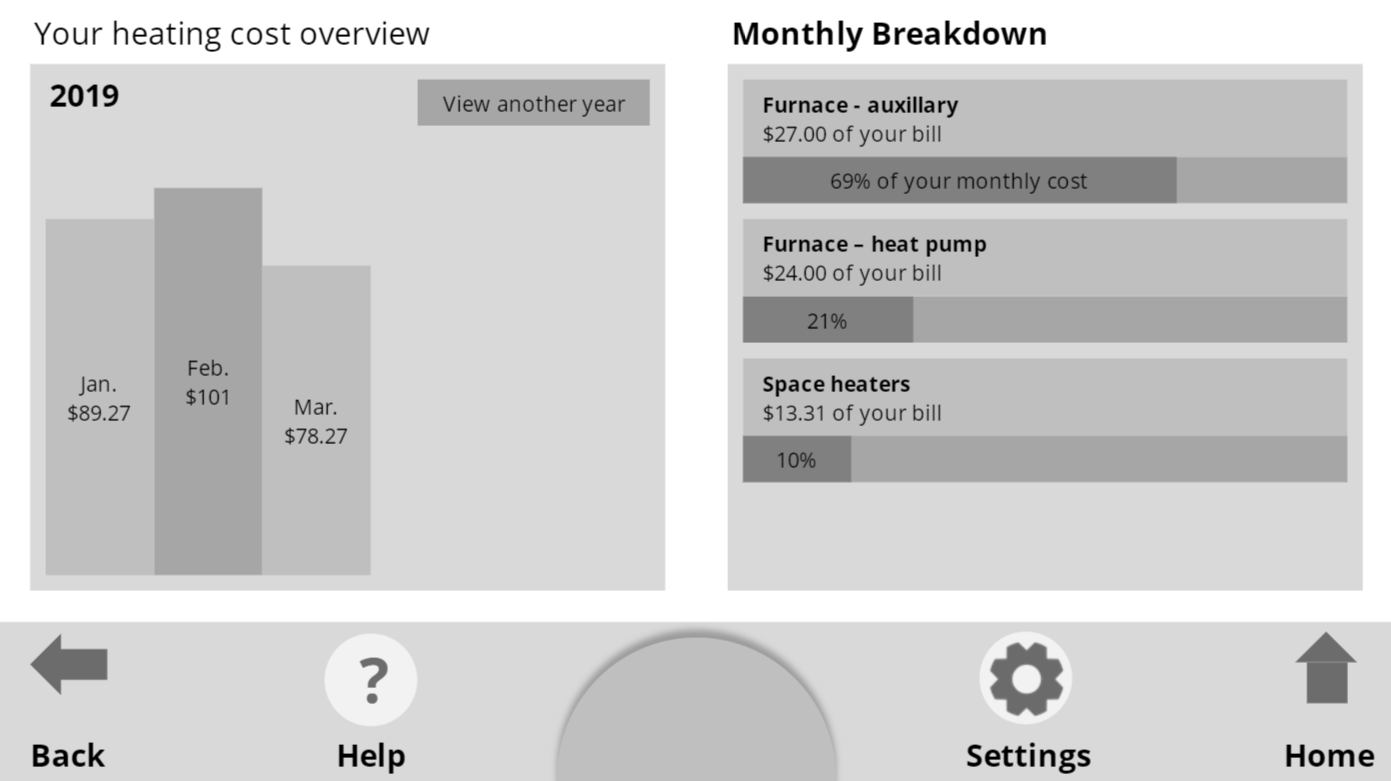
A detailed view of overall heating consumption per month over a given year and by heating type in the current month
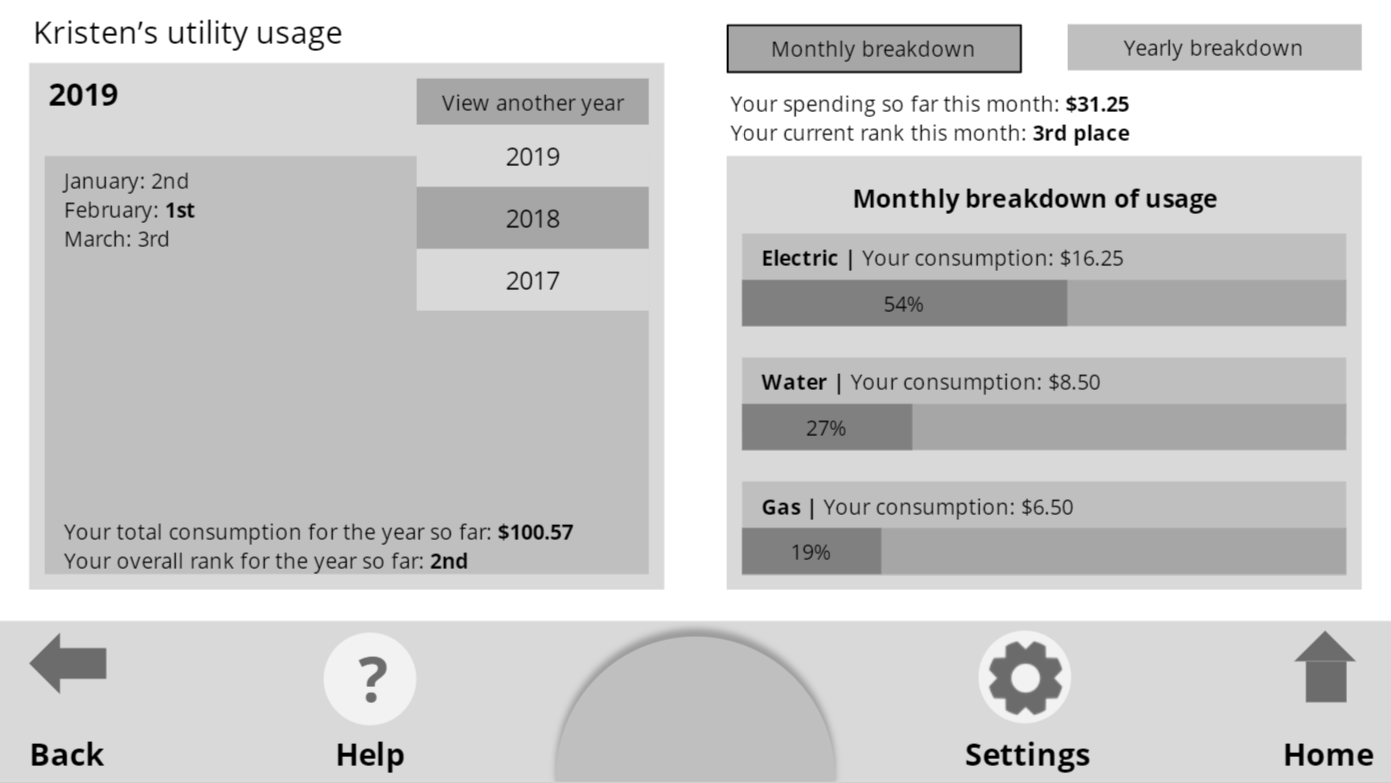
A user's profile view after entering the comparison branch of the app